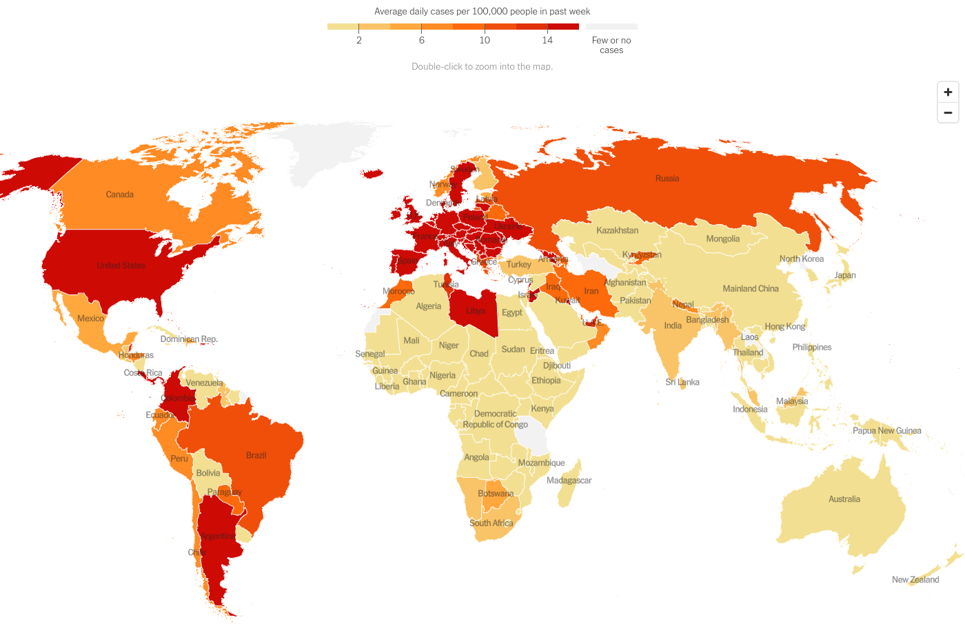
Hot Spots
GIS plot of the world showing which countries are seeing a rise in infections

Today we will make the Hot Spots map from the article Coronavirus Map: Tracking the Global Outbreak that looks like the following -
import altair as alt
import pandas as pd
import geopandas as gpd
alt.renderers.set_embed_options(actions=False)
#world = gpd.read_file("https://www.naturalearthdata.com/http//www.naturalearthdata.com/download/10m/cultural/ne_10m_admin_0_countries.zip")
world = gpd.read_file("https://www.naturalearthdata.com/http//www.naturalearthdata.com/download/110m/cultural/ne_110m_admin_0_countries.zip")
world.head()
world = world[['ADMIN', 'NAME', 'ISO_A3', 'CONTINENT', 'geometry']]
world
world = world[~(world['CONTINENT']=='Antarctica')]
alt.Chart(world).mark_geoshape(stroke='white').encode()
somalia = world[world['NAME'].str.contains('Somali')]
somalia = somalia.dissolve(by='CONTINENT').reset_index()
world=pd.concat([world, somalia])
world.loc[world['ADMIN'].str.contains('eSwatini'), 'ADMIN'] = 'Eswatini'
world.loc[world['ADMIN'].str.contains('Palestine'), 'ADMIN'] = 'West Bank and Gaza'
world.loc[world['ADMIN'].str.contains('Republic of Serbia'), 'ADMIN'] = 'Serbia'
world.loc[world['ADMIN'].str.contains('United Republic of Tanzania'), 'ADMIN'] = 'Tanzania'
world.loc[world['ADMIN'].str.contains('São Tomé and Principe'), 'ADMIN'] = 'Sao Tome and Principe'
world.columns = ['Country_Region', 'NAME', 'iso3', 'CONTINENT', 'geometry']
population_uri = 'https://raw.githubusercontent.com/CSSEGISandData/COVID-19/master/csse_covid_19_data/UID_ISO_FIPS_LookUp_Table.csv'
population_data = pd.read_csv(population_uri)
population_data = population_data.drop(['UID', 'iso2', 'code3', 'FIPS', 'Admin2', 'Province_State'], axis=1)
population_data = population_data[population_data['Country_Region'] == population_data['Combined_Key']]
population_data = population_data.drop(['Country_Region', 'Combined_Key'], axis=1)

population_data = population_data.reset_index(drop=True)
population_data.head()
population_data
uri = 'https://raw.githubusercontent.com/CSSEGISandData/COVID-19/master/csse_covid_19_data/csse_covid_19_time_series/time_series_covid19_confirmed_global.csv'
time_s_raw = pd.read_csv(uri)
time_s_raw
time_s = time_s_raw.groupby('Country/Region').agg(dict(zip(time_s_raw.columns[4:], ['sum']*(len(time_s_raw.columns)-4))))
time_s = time_s.reset_index()
time_s
time_s.loc[time_s['Country/Region']=='Korea, South', 'Country/Region'] = 'South Korea'
time_s.loc[time_s['Country/Region']=="Cote d'Ivoire", 'Country/Region'] = 'Ivory Coast'
time_s.loc[time_s['Country/Region']=='Timor-Leste', 'Country/Region'] = 'East Timor'
time_s.loc[time_s['Country/Region']=='Taiwan*', 'Country/Region'] = 'Taiwan'
time_s.loc[time_s['Country/Region']=='Burma', 'Country/Region'] = 'Myanmar'
time_s.loc[time_s['Country/Region']=='US', 'Country/Region'] = 'United States of America'
time_s.loc[time_s['Country/Region']=='Czech Republic', 'Country/Region'] = 'Czechia'
time_s.loc[time_s['Country/Region']=='North Macedonia', 'Country/Region'] = 'Macedonia'
time_s.loc[time_s['Country/Region']=='Bahamas', 'Country/Region'] = 'The Bahamas'
time_s.loc[time_s['Country/Region']=='Congo (Kinshasa)', 'Country/Region'] = 'Democratic Republic of the Congo'
time_s.loc[time_s['Country/Region']=='Congo (Brazzaville)', 'Country/Region'] = 'Republic of the Congo'
time_s_T = time_s.set_index('Country/Region').T
time_s_T
time_s_T = time_s_T.apply(lambda x: x.diff(), axis=0)
time_s_T
Just get the sum of last 7 days - that's all you need per country.
hot_spots = time_s_T.tail(7).sum().to_frame(name="past_7_days").reset_index().rename(columns={'Country/Region': 'Country_Region'})
hot_spots.past_7_days = hot_spots.past_7_days/7
hot_spots
world = world.merge(hot_spots, on='Country_Region', how='inner')
world.info()
world = world.merge(population_data, on='iso3', how='left')
world
world = world.assign(average_daily_per_capita = (world.past_7_days/world.Population)*100000)
world
alt.Chart(world).mark_geoshape(stroke='white').encode(
    color=alt.Color('average_daily_per_capita:Q'),
    tooltip = ['Country_Region:N', 'average_daily_per_capita:Q']
).properties(width=1400, height=800).project('equalEarth').configure_view(strokeWidth=0)
world = world.assign(Average_Daily_Cases = world.average_daily_per_capita.apply(lambda x: 16 if x>14 else x))
color_scale = ['#f2df91', '#f9c467', '#ffa83e', '#ff8b24', '#fd6a0b', '#f04f09', '#e13107', '#ce0a05']
grey = "#f2f2f2"
world_map = alt.Chart(world).mark_geoshape(stroke='white').encode(
    color=alt.Color('Average_Daily_Cases:Q', scale=alt.Scale(range=color_scale), bin=alt.Bin(base=2, step=2, extent=[0,16])),
    tooltip = ['Country_Region:N', 'average_daily_per_capita:Q']
).properties(width=1400, height=600).project('equalEarth')
world_map.configure_view(strokeWidth=0)
This is a custom color scale. Exact results with countries that do not publish data can only be reached when we scale color using a color field. Otherwise this is the best we can do.