Tracking the Global Outbreak: Growth Rates
Layered facet chart of growth rates in every country where there are more than 100 cases.

Today we will make the growth rate charts from the NYT article on Tracking the Global Outbreak for all the countries.
We will use the JHU CSSE dataset since NYT does not provide its own global countries dataset
#hide_output
import pandas as pd
import altair as alt
raw_data_url = 'https://raw.githubusercontent.com/CSSEGISandData/COVID-19/master/csse_covid_19_data/csse_covid_19_time_series/time_series_covid19_confirmed_global.csv'
raw_df = pd.read_csv(raw_data_url)
alt.renderers.set_embed_options(actions=False)
A few important observations -
- There are some countries that have data at a finer level like state/county. For those countires we will extract the extract the corresponding rows, sum them up into a single row and transpose it to convert to a dataframe.
- Those exceptional countries are 'Australia', 'Canada', 'China', 'Denmark', 'France', 'Netherlands', 'United Kingdom'
Let's convert the data into the desired long form from the existing wide form.
# collapse
long_df = pd.DataFrame()
exceptional_countries = ['Australia', 'Canada', 'China', 'Denmark', 'France', 'Netherlands', 'United Kingdom']
country_df_list = []
def extract_country(s):
    if s[1].strip() not in exceptional_countries:
    #     print(f"{s[1]} - exceptional case")
    # else:
        temp_df = pd.DataFrame(s[4:])
        temp_df.columns = ['value']
        temp_df['country'] = s[1]
        temp_df['growth'] = temp_df['value'].diff()
        temp_df['growth'][0] = temp_df['value'].iloc[0]
        temp_df['growth'] = temp_df['growth'].astype(int)
        temp_df = temp_df.rename_axis('date').reset_index()
        country_df_list.append(temp_df)

for country in exceptional_countries:
    temp_df = pd.DataFrame(raw_df[raw_df['Country/Region'] == country].iloc[:,4:].sum(axis=0).rename_axis('date').reset_index())
    temp_df.columns = ['date','value']
    temp_df['country'] = country
    temp_df['growth'] = temp_df['value'].diff()
    temp_df.loc[0, 'growth'] = temp_df['value'].iloc[0]
    temp_df['growth'] = temp_df['growth'].astype(int)
    country_df_list.append(temp_df)

raw_df.apply(extract_country, axis=1)
long_df = pd.concat(country_df_list)
Beacause this is a large dataset, Altair will - by default - refuse to display because of possible memory issues. So we will have to enable the json transformer so that the data is passed insternally as a url. We enable it using alt.data_transformers.enable('json'). Do this if you are running it locally. To do the same on Fastpages, I have already uploaded the json file that is generated by Altair behind the scenes and and I will pass the url of the file to the chart so that the output visualization is seen on the website.
# collapse
#alt.data_transformers.enable('json') # use this if running locally
#alt.data_transformers.disable_max_rows() # avoid this as it can hang your system
url = 'https://raw.githubusercontent.com/armsp/covidviz/master/assets/2020-06-02-Data.json' #comment this when running locally otherwise you will have old data till 1st June only

a = alt.Chart().mark_bar(size=2, opacity=0.2, color='gray').transform_window(
    rolling_mean = 'mean(growth)',
    frame=[-6, 0],
    groupby=['place']
).encode(
    x=alt.X('date:T', title=None),
    y=alt.Y("growth:Q", title=None),
).properties(width=90, height=100)

b = alt.Chart().mark_area(fill='red', fillOpacity=0.4).transform_window(
    rolling_mean = 'mean(growth)',
    frame=[-6, 0],
    groupby=['place']
).encode(
    x=alt.X('date:T'),
    y=alt.Y("rolling_mean:Q",title='cases')
)

c = b.mark_line(**{"color": "red", "opacity": 0.7, "strokeWidth": 2})

alt.layer(a, c, data=url).facet(alt.Column('country:N', title=None, sort=alt.EncodingSortField('value', op='max', order='descending'),
    header=alt.Header(labelFontSize=13, labelColor='gray', labelFontWeight='bolder', labelAlign='center', labelAnchor='middle', labelOrient='top', labelPadding=-15, labelAngle=0)),
    spacing=alt.RowColnumber(row=70, column=0),
    title="Countrywise Distribution of Growth, Averaged over 7 days",
    columns=7,

).configure_axis(
    grid=False,
    #domainWidth=0.1
).configure_view(strokeWidth=0).configure_title(
    fontSize=25,
    font='Courier',
    anchor='middle',
    color='gray',
    dy=-30
)
There are a few issues with the above chart -
- We are seeing negative values in growth rate, How can it be negative? The lowest it can go is 0.
- The graphs for countries with very few cases don't look good.
- The scales of the countries vary a lot. We need to adjust the scale like NYT does, to make it readable.
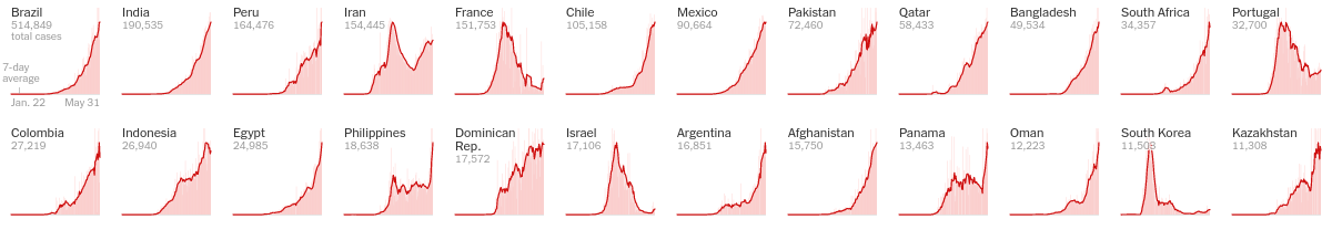
Let's improve upon the issues above with the following solutions -
- NYT does not show graphs for those with fewer than 100 cases. Like NYT we have filtered countries with less than 100 cases
- The growth rates will be negative if there are discrepancies in the data - when the cumulative cases drop for any reason than the previous day. You will certainly notice thos in the dataset for some of the countries.
- We will filter the negative values as based on my observation that's what NYT seems to be doing
- Independednt Y axis
Few points to keep in mind -
- The bar chart shows the increment in cases per day
- The line chart is the 7 day average of growth in cases per day
- The facet is ordered in descending order by the maximum number of cases
- We will forcefully align the countries one below the other because choosing independent axes often leads to misaligned facet items
# collapse
a = alt.Chart().mark_bar(size=2, opacity=0.05, color='red').transform_filter(
    alt.datum.growth >= 0).transform_filter(alt.datum.value > 100).transform_window(
    rolling_mean = 'mean(growth)',
    frame=[-6, 0],
    groupby=['place']
).encode(
    x=alt.X('date:T', title=None),
    y=alt.Y("growth:Q", title=None),
).properties(width=90, height=100)

b = alt.Chart().mark_area(fill='red', fillOpacity=0.04).transform_filter(
    alt.datum.growth >= 0).transform_filter(alt.datum.value > 100).transform_window(
    rolling_mean = 'mean(growth)',
    frame=[-6, 0],
    groupby=['place']
).encode(
    x=alt.X('date:T'),
    y=alt.Y("rolling_mean:Q",title='cases')
)

c = b.mark_line(**{"color": "red", "opacity": 0.7, "strokeWidth": 2})

alt.layer(a, b, c, data=url).facet(alt.Column('country:N', title=None, sort=alt.EncodingSortField('value', op='max', order='descending'),
    header=alt.Header(labelFontSize=13, labelColor='gray', labelFontWeight='bolder', labelAlign='center', labelAnchor='middle', labelOrient='top', labelPadding=-15, labelAngle=0)),
    spacing=alt.RowColnumber(row=70, column=5),
    title="Countrywise Distribution of Growth, Averaged over 7 days",
    columns=7,
    align='each',
).resolve_scale(y='independent', x='independent',).configure_axis(
    grid=False,
    #domainWidth=0.1
).configure_view(strokeWidth=0).configure_title(
    fontSize=25,
    font='Courier',
    anchor='middle',
    color='gray',
    dy=-30
)
Feel free to comment below if you didn't understand anything and I will try my best to answer