Job Reports by Industry
Interpolated step area chart with a twist

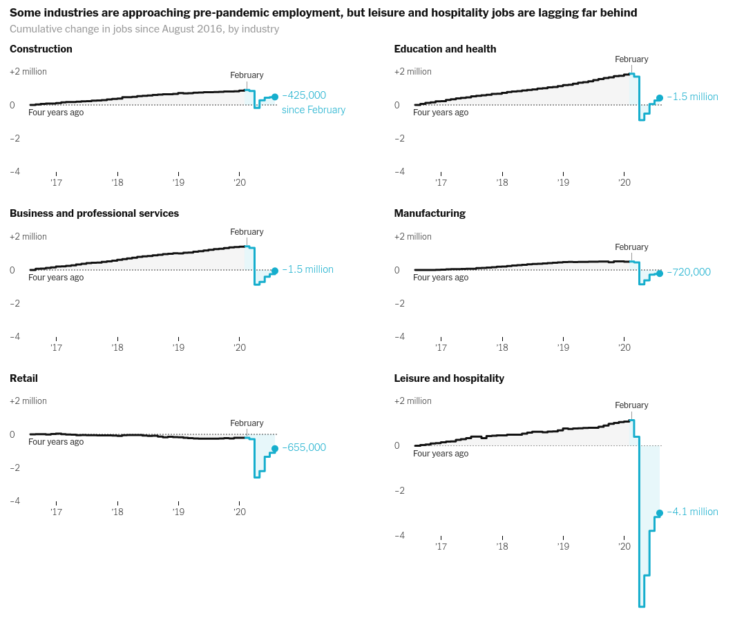
Today we will make the chart that looks like above which appeared the following reports on Slowdown of job growth in various industries -
Finding out the data used by the articles was tedious but I managed it anyways. Here's how did it -
- Main cited source is Beaureau of Labour Statistics
- Painfully going through the website, didn't make much sense of all that was there. Too much info.
- Google Search - BLS employment by industry data
- Opened this link and thought this looks interesting - https://www.bls.gov/charts/employment-situation/employment-levels-by-industry.htm#
- We know now that we need Employmnt by Industry Data
- Lets try API - https://www.bls.gov/data/#api -> https://www.bls.gov/developers/
- Python Example - https://www.bls.gov/developers/api_python.htm#python2
- So we need Series ID for the tables
- Data Tools -> Series Report -> Series ID Formats -> Employment & Unemployment -> National Employment, Hours, and Earnings -> That has all the information about how to construct the query.
- Queried Answer matches exactly the Show Table result on the 3rd Step!
import altair as alt
import requests
import pandas as pd

alt.renderers.set_embed_options(actions=False)

uri = "https://api.bls.gov/publicAPI/v2/timeseries/data/"
headers = {'User-Agent': 'Mozilla/5.0 (Macintosh; Intel Mac OS X 10_10_1) AppleWebKit/537.36 (KHTML, like Gecko) Chrome/39.0.2171.95 Safari/537.36'}
headers = {'Content-type': 'application/json'}
r = requests.post(uri, data='{"seriesid":["CES6500000001", "CES6000000001", "CES3000000001", "CES7000000001", "CES4200000001", "CES2000000001"], "startyear":"2016", "endyear":"2020"}', headers=headers)
data = pd.concat([pd.DataFrame({'type': x['seriesID'], **(pd.concat([pd.Series(y).to_frame().T for y in x['data']])[::-1].to_dict(orient='list'))}) for x in r.json()['Results']['series']])
data = data.reset_index(drop=True)
data.head()
data['value'] = data['value'].astype(float)
data['time'] = pd.to_datetime(data['year']+data['periodName'], format="%Y%B")
data = data.assign(change = data.groupby('type')['value'].transform('diff').reset_index(drop=True))
data = data.assign(cumulative_change = data.groupby('type')['value'].apply(lambda x: x - x.iloc[0]))
data.head()
data['type'] = data['type'].apply(lambda x: 'Construction' if x == 'CES2000000001' else 'Education and health' if x == 'CES6500000001' else 'Business and professional services' if x == 'CES6000000001' else 'Manufacturing' if x == 'CES3000000001' else 'Leisure and hospitality' if x == 'CES7000000001' else 'Retail')
plot_data = data.copy()
plot_data = plot_data.assign(since_feb = plot_data['type'].map(plot_data.groupby('type').apply(lambda x: int(x['value'].iloc[-1] - x[x['time'] == '2020-02-01']['value']))))
plot_data.groupby('type').apply(lambda x: int(x[x['time'] == '2020-02-01']['value'] - x['value'].iloc[-1])).reset_index(level=0,drop=True)
# plot_data[plot_data['type'] == 'Education and health']
plot_data.info()
We will use step-after interpolation method. Find out more about meaning of various interpolation methods at https://github.com/d3/d3-shape/blob/master/README.md#curves
alt.Chart(data, height=200, title="Some industries are approaching pre-pandemic employment, but leisure and hospitality jobs are lagging far behind").mark_area(line=True, interpolate='step-after',).encode(
    x= alt.X('time', title=None),
    y= alt.Y('cumulative_change:Q', title=None, scale=alt.Scale(domain=[-3000, 3000])),
#     row = alt.Row('type:N', rows=3)
    facet = alt.Facet('type:N', columns=2, spacing={'row': -200},
                      sort=['Construction', 'Education and health', 'Business and professional services', 'Manufacturing', 'Retail', 'Leisure and hospitality'],
                      title="Cumulative change in jobs since August 2016, by industry"
                     )
).resolve_axis(y='independent', x='independent')
Let's try to colour them differently from February -
alt.Chart(data, height=200, title="Some industries are approaching pre-pandemic employment, but leisure and hospitality jobs are lagging far behind"
         ).mark_area(
    line=True,
    interpolate='step-after'
    ).transform_calculate(
    recent = alt.datum.time > alt.expr.toDate('2020-01-31')
).encode(
    x= alt.X('time', title=None),
    y= alt.Y('cumulative_change:Q', title=None, scale=alt.Scale(domain=[-3000, 3000])),
    color = 'recent:N',
    stroke = 'recent:N',
#     row = alt.Row('type:N', rows=3)
    facet = alt.Facet('type:N', columns=2, spacing={'row': -200},
                      sort=['Construction', 'Education and health', 'Business and professional services', 'Manufacturing', 'Retail', 'Leisure and hospitality'],
                      title="Cumulative change in jobs since August 2016, by industry"
                     )
).resolve_axis(y='independent', x='independent')
The lines are overlapped. Let's try a different approach -
base = alt.Chart(height=200).transform_calculate(
    recent = alt.datum.time >= alt.expr.toDate('2020-01-01')
).encode(
    x= alt.X('time:T', title=None),
    y= alt.Y('cumulative_change:Q', title=None, scale=alt.Scale(domain=[-3000, 3000])),
    tooltip=['time']
)

area = base.mark_area(interpolate='step-after', fillOpacity=0.6).encode(color = 'recent:N')

line = base.mark_line(interpolate='step-after', color="blue").encode(color = 'recent:N')#'recent:N',)

alt.layer(area,line, data=plot_data).facet(alt.Facet('type:N',
                      sort=['Construction', 'Education and health', 'Business and professional services', 'Manufacturing', 'Retail', 'Leisure and hospitality'],
                      title="Cumulative change in jobs since August 2016, by industry"
                     )
).resolve_axis(y='independent', x='independent').configure_facet(columns=2).properties(title="Some industries are approaching pre-pandemic employment, but leisure and hospitality jobs are lagging far behind")
That was better. Let's make it aesthetically pleasing -
base = alt.Chart(height=200).transform_calculate(
    recent = alt.datum.time >= alt.expr.toDate('2020-01-01')
).encode(
    x= alt.X('time:T', title=None, axis=alt.Axis(format="%y", domainDash=[2,2.5], domainWidth=1.5, tickCount=5, domain=False, labelPadding=1)),
    y= alt.Y('cumulative_change:Q', title=None, axis=alt.Axis(domain=False), scale=alt.Scale(domain=[-2000, 2000])),
)

area = base.mark_area(interpolate='step-after', fillOpacity=0.1).encode(color = alt.Color('recent:N', legend=None))

line = base.mark_line(interpolate='step-after', strokeCap="round").encode(color = alt.Color('recent:N', scale=alt.Scale(domain=['false', 'true'], range=['black', 'rgb(22, 174, 205)'])))#'recent:N',)

dot = base.mark_circle(color='rgb(22, 174, 205)', size=50).encode(
    x='max(time)',
    y=alt.Y('cumulative_change:Q', aggregate={'argmax': 'time'}),
)

text = base.mark_text(align='left', dx=10).encode(
    x='max(time)',
    y=alt.Y('cumulative_change:Q', aggregate={'argmax': 'time'}),
    text=alt.Text('since_feb:Q', aggregate={'argmax': 'time'})
)

h_rule = alt.Chart(pd.DataFrame({'zero': [[0]]})).mark_rule(strokeDash=[2,2]).encode(y='zero:Q')

alt.layer(area,line,dot,text, h_rule, data=plot_data).facet(facet=alt.Facet('type:N',
                      sort=['Construction', 'Education and health', 'Business and professional services', 'Manufacturing', 'Retail', 'Leisure and hospitality'],
                      header=alt.Header(title="Cumulative change in jobs since August 2016, by industry", titleOrient="top", titleAnchor='start', titleFontSize=15, titleColor='grey')
                     ), spacing={"row": -100}
).resolve_axis(y='independent', x='independent').configure_facet(columns=2).configure_axis(grid=False).configure_view(stroke=None).properties(title="Some industries are approaching pre-pandemic employment, but leisure and hospitality jobs are lagging far behind").configure_title(fontSize=17)
We cannot fix the row spacing because of the last chart - all the facet charts will have the area of the sub-chart with the mximum area.