Missing Deaths
Tracking the True Toll of the Coronavirus Outbreak. Making a layered chart comprising an area chart of yearly average deaths per week, and multiple line charts showing weekly death trends per year, in various countries.

Today we will make the following graph that shows the excess deaths as appeared in the article 87,000 Missing Deaths: Tracking the True Toll of the Coronavirus Outbreak
Fortunately the NYT provides the dataset for this in their repository.
What does Excess Death mean and how do we calculate it?
Excess deaths are estimates that include deaths from Covid-19 and other causes. Reported Covid-19 deaths reflect official coronavirus deaths during the period when all-cause mortality data is available, including figures that were later revised.
According to the github repository -
Official Covid-19 death tolls offer a limited view of the impact of the outbreak because they often exclude people who have not been tested and those who died at home. All-cause mortality is widely used by demographers and other researchers to understand the full impact of deadly events, including epidemics, wars and natural disasters. The totals in this data include deaths from Covid-19 as well as those from other causes, likely including people who could not be treated or did not seek treatment for other conditions.
Expected Deaths
We have calculated an average number of expected deaths for each area based on historical data for the same time of year. These expected deaths are the basis for our excess death calculations, which estimate how many more people have died this year than in an average year.
The number of years used in the historical averages changes depending on what data is available, whether it is reliable and underlying demographic changes. The baselines do not adjust for changes in age or other demographics, and they do not account for changes in total population.
The number of expected deaths are not adjusted for how non-Covid-19 deaths may change during the outbreak, which will take some time to figure out. As countries impose control measures, deaths from causes like road accidents and homicides may decline. And people who die from Covid-19 cannot die later from other causes, which may reduce other causes of death. Both of these factors, if they play a role, would lead these baselines to understate, rather than overstate, the number of excess deaths.
That is what we are going to do, average the results based on the baseline field to show the blue line for expected deaths. However it also looks like they are using some sort of linear model and smoothing as mentioned in the accompanying news article -
To estimate expected deaths, we fit a linear model to reported deaths in each country from 2015 to January 2020. The model has two components — a linear time trend to account for demographic changes and a smoothing spline to account for seasonal variation. For countries limited to monthly data, the model includes month as a fixed effect rather than using a smoothing spline.
Since there isn't much information on that we will ignore it for the time being.
What's the insight that this data gives?
These numbers undermine the notion that many people who have died from the virus may soon have died anyway. In Britain, which has recorded more Covid-19 deaths than any country except the United States, 59,000 more people than usual have died since mid-March — and about 14,000 more than have been captured by official death statistics.
import pandas as pd
import altair as alt

alt.renderers.set_embed_options(actions=False)

url = "https://raw.githubusercontent.com/nytimes/covid-19-data/master/excess-deaths/deaths.csv"
raw = pd.read_csv(url)
Lets study Sweden, Switzerland, UK and France for our charts
sweden = raw[raw['country'] == "Sweden"]
switzerland = raw[raw['country'] == "Switzerland"]
uk = raw[raw['country'] == "United Kingdom"]
france = raw[raw['country'] == "France"]
Let's start with a simple layered chart - area for year 2019 and line for 2020. We will not average anything right now nor will we use all the fields in our dataset.
base = alt.Chart(sweden).encode(
    x=alt.X('week')
)
alt.layer(
    base.mark_area(fill='lightblue', line=True, fillOpacity=0.3).transform_filter("datum.year == 2019").encode(y='deaths'),
    base.mark_line(color='maroon').transform_filter("datum.year == 2020").encode(y='deaths'),
).properties(width=500)
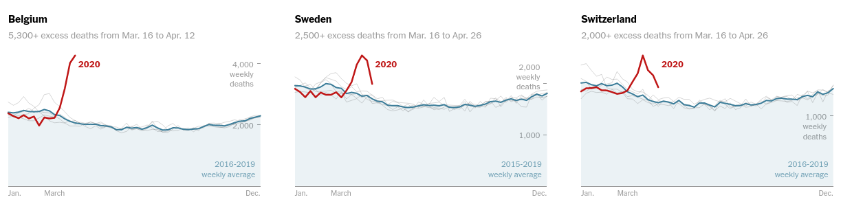
For Sweden they plot the gray lines for years 2015 to 2019. The blue line is the weekly average per year and the maroon line is the deaths in 2020.
# collapse
base = alt.Chart(sweden).encode(
    x='week',
).properties(height=200)

lines = alt.layer(
    base.mark_line(color="gray", strokeWidth=0.5).transform_filter("datum.year == 2015").encode(y='deaths'),
    base.mark_line(color="gray", strokeWidth=0.5).transform_filter("datum.year == 2016").encode(y='deaths'),
    base.mark_line(color="gray", strokeWidth=0.5).transform_filter("datum.year == 2017").encode(y='deaths'),
    base.mark_line(color="gray", strokeWidth=0.5).transform_filter("datum.year == 2018").encode(y='deaths'),
    base.mark_line(color="gray", strokeWidth=0.5).transform_filter("datum.year == 2019").encode(y='deaths'),
    base.mark_line(color='maroon').transform_filter("datum.year == 2020").encode(y='deaths'),
).properties(width=400)

avg = base.mark_area(fill='lightblue', line=True, fillOpacity=0.3).transform_filter("datum.year < 2020").encode(
    y='average(deaths)',
).properties(width=500)

avg + lines
Looks like we capture the trend pretty well
Similarly for Switzerland, we will also turn off the grid and the view box -
# collapse
base = alt.Chart(switzerland).encode(
    x='week',
).properties(height=300, width=500)

lines = alt.layer(
    base.mark_line(color="gray", strokeWidth=0.5).transform_filter("datum.year == 2015").encode(y='deaths'),
    base.mark_line(color="gray", strokeWidth=0.5).transform_filter("datum.year == 2016").encode(y='deaths'),
    base.mark_line(color="gray", strokeWidth=0.5).transform_filter("datum.year == 2017").encode(y='deaths'),
    base.mark_line(color="gray", strokeWidth=0.5).transform_filter("datum.year == 2018").encode(y='deaths'),
    base.mark_line(color="gray", strokeWidth=0.5).transform_filter("datum.year == 2019").encode(y='deaths'),
    base.mark_line(color='maroon').transform_filter("datum.year == 2020").encode(y='deaths'),
).properties(width=400)

avg = base.mark_area(fill='lightblue', line=True, fillOpacity=0.3).transform_filter("datum.year < 2020").encode(
    y='average(deaths)',
)

(avg+lines).configure_view(strokeWidth=0).configure_axis(grid=False)
Trying the same for U.K -
# collapse
base = alt.Chart(uk).encode(
    x='week',
).properties(height=300, width=550)

l = alt.layer(
    base.mark_line(color="gray", strokeWidth=0.5).transform_filter("datum.year == 2015").encode(y='deaths'),
    base.mark_line(color="gray", strokeWidth=0.5).transform_filter("datum.year == 2016").encode(y='deaths'),
    base.mark_line(color="gray", strokeWidth=0.5).transform_filter("datum.year == 2017").encode(y='deaths'),
    base.mark_line(color="gray", strokeWidth=0.5).transform_filter("datum.year == 2018").encode(y='deaths'),
    base.mark_line(color="gray", strokeWidth=0.5).transform_filter("datum.year == 2019").encode(y='deaths'),
    base.mark_line(color='maroon').transform_filter("datum.year == 2020").encode(y='deaths'),
).properties(width=400)

rule = base.mark_area(fill='lightblue', line=True, fillOpacity=0.3).transform_filter("datum.year < 2020").encode(
    y='average(deaths)',
)
(rule+l).configure_view(strokeWidth=0).configure_axis(grid=False)
Let's make use of loops to do the same but for France (based on observation it looks like the gray lines are from 2015 to 2019) -
# collapse
base = alt.Chart(france).encode(
    x='week',
).properties(height=300, width=550)

avg = base.mark_area(fill='lightblue', line=True, fillOpacity=0.3).transform_filter("datum.year < 2020").encode(
    y='average(deaths)',
)

layer = []
for year in range(2015, 2021):
    l = base.mark_line(color="gray", strokeWidth=0.5).transform_filter(f"datum.year == {year}").encode(y='deaths')
    if year == 2020:
        l = base.mark_line(color='maroon').transform_filter(f"datum.year == {year}").encode(y='deaths')
    layer.append(l)

alt.layer(avg,*layer).configure_view(strokeWidth=0).configure_axis(grid=False)
The excess deaths articles and graphs update frequently and the graphics also changes quite a bit -
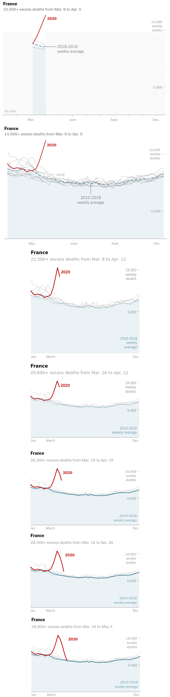
In the latest versions of the charts they started using dashed lines, for that we will use strokeDash = alt.value([3,3])
# collapse
base = alt.Chart(france).encode(
    x='week',
).properties(height=300, width=550)

avg = base.mark_area(fill='lightblue', line=True, strokeDash=[1,2], fillOpacity=0.3).transform_filter("datum.year < 2020").encode(
    y='average(deaths)',
    strokeDash = alt.value([3,3])
)

layer = []
for year in range(2015, 2021):
    l = base.mark_line(color="gray", strokeWidth=0.5).transform_filter(f"datum.year == {year}").encode(y='deaths')
    if year == 2020:
        l = base.mark_line(color='maroon').transform_filter(f"datum.year == {year}").encode(y='deaths')
    layer.append(l)

alt.layer(avg,*layer).configure_view(strokeWidth=0).configure_axis(grid=False)