Covid Death Rates Graph
Making a layered chart comprising a step area chart of deaths per day, and a rectangle chart starting from the day of Stay at Home Order for states in the U.S

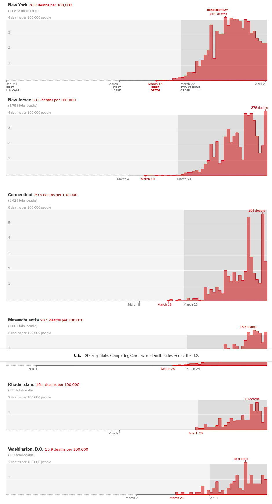
The graph that we will learn to make today is from the NYT article on Comparing Coronavirus Death Rates Across the U.S
import altair as alt
import pandas as pd
alt.renderers.set_embed_options(actions=False)

url = "https://raw.githubusercontent.com/nytimes/covid-19-data/master/us-states.csv"
usdf = pd.read_csv(url)
nydf = usdf[(usdf['state'] == "New York") & (usdf['date'] < '2020-04-23')]
nydf['deaths_perday'] = nydf['deaths'].diff()

chart = alt.Chart(nydf).mark_area(fill='red', fillOpacity=0.5, line=True, interpolate='step-after',).encode(
    x='date:T',
    y='deaths_perday:Q',
    color=alt.value('red') # Exceptional Case, bug in Vega or Vega Lite - https://stackoverflow.com/questions/62005052/how-do-i-change-the-line-color-in-altairs-filled-step-chart

).properties(height=250, width=700).configure_view(
    strokeWidth=0
).configure_axis(
    grid=False,
    title=None
)
chart
To highlight the region after the Stay at Home order date, we will use a Rectangle Chart - mark_react()
We will also make a new source data that contains the starting date of the stay at home order and the perhaps the end date of stay at home or just the latest data in the dataset. NYT has not updated this graph and has data only till 21st or 22nd April.
# collapse
chart = alt.Chart(nydf).mark_area(fill='red', fillOpacity=0.5, line=True, interpolate='step-after',).encode(
    x='date:T',
    y='deaths_perday:Q',
    color=alt.value('red') # Exceptional Case, bug in Vega or Vega Lite - https://stackoverflow.com/questions/62005052/how-do-i-change-the-line-color-in-altairs-filled-step-chart

).properties(height=250, width=700)
This is the important piece of code on how to set up the Rectangle chart
source2 = [{
            "start": "2020-03-23",
            "end": nydf['date'].max(),
            "event": "Stay at Home"
          }]
source2 = alt.pd.DataFrame(source2)

rect = alt.Chart(source2).mark_rect().encode(
    x =  'start:T',
    x2 = 'end:T',
    color=alt.value('lightgray')
)
(rect+chart).configure_view(
    strokeWidth=0
).configure_axis(
    grid=False,
    title=None
)
Similarly you can do the same for any other state. Lets try Michigan for a change -
michdf = usdf[(usdf['state'] == "Michigan") & (usdf['date'] < '2020-04-23')]
michdf['deaths_perday'] = michdf['deaths'].diff()
# collapse
chart = alt.Chart(michdf).mark_area(fill='red', fillOpacity=0.5, line=True, interpolate='step-after',).encode(
    x='date:T',
    y='deaths_perday:Q',
    color=alt.value('red') # Exceptional Case, bug in Vega or Vega Lite - https://stackoverflow.com/questions/62005052/how-do-i-change-the-line-color-in-altairs-filled-step-chart

).properties(height=150, width=700)

source2 = [{
            "start": "2020-03-25",
            "end": michdf['date'].max(),
            "event": "Stay at Home"
          }]
source2 = alt.pd.DataFrame(source2)

rect = alt.Chart(source2).mark_rect().encode(
    x =  'start:T',
    x2 = 'end:T',
    color=alt.value('lightgray')
)

(rect+chart).configure_view(
    strokeWidth=0
).configure_axis(
    grid=False,
    title=None
)
The visualization till the latest date for NY would look like the following -
# collapse
nydf = usdf[(usdf['state'] == "New York")]
nydf['deaths_perday'] = nydf['deaths'].diff()
nydf = nydf[nydf['date'] <= '2020-05-31']

chart = alt.Chart(nydf).mark_area(fill='red', fillOpacity=0.5, line=True, interpolate='step-after',).encode(
    x='date:T',
    y='deaths_perday:Q',
    color=alt.value('red') # Exceptional Case, bug in Vega or Vega Lite - https://stackoverflow.com/questions/62005052/how-do-i-change-the-line-color-in-altairs-filled-step-chart

).properties(height=250, width=700)

source2 = [{
            "start": "2020-03-23",
            "end": nydf['date'].max(),
            "event": "Stay at Home"
          }]
source2 = alt.pd.DataFrame(source2)

rect = alt.Chart(source2).mark_rect().encode(
    x =  'start:T',
    x2 = 'end:T',
    color=alt.value('lightgray')
)
(rect+chart).configure_view(
    strokeWidth=0
).configure_axis(
    grid=False,
    title=None
)