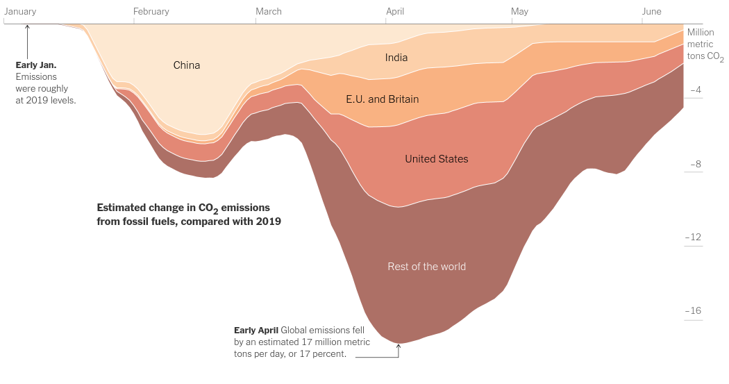
Temporary decline in CO₂ due to COVID-19
Stacked area plot of drop in CO₂ emissions

Today we will work on the following graph from the article Emissions Are Surging Back as Countries and States Reopen -
I downloaded the dataset as an Excel file and saved data for individual countries as csv files.
import altair as alt
import pandas as pd
from functools import wraps
import datetime as dt
#hide_output
alt.renderers.set_embed_options(actions=False)

def log_step(func):
    @wraps(func)
    def wrapper(*args, **kwargs):
        """timing or logging etc"""
        start = dt.datetime.now()
        output = func(*args, **kwargs)
        end = dt.datetime.now()
        print(f"After function {func.__name__} ran, shape of dataframe is - {output.shape}, execution time is - {end-start}")
        return output
    return wrapper

@log_step
def read_concat_country_data():
    india = pd.read_csv('ind_co2_em.csv')
    india = india.iloc[1:]

    china = pd.read_csv('china_co2_em.csv', sep=';')
    china = china.iloc[1:]

    us = pd.read_csv('us_co2_em.csv', sep=';')
    us = us.iloc[1:]

    euuk = pd.read_csv('euuk_co2_em.csv', sep=';')
    euuk = euuk.iloc[1:]

    globl = pd.read_csv('global_co2_em.csv', sep=';')
    globl = globl.iloc[1:]

    data = pd.concat([china, india, euuk, us, globl])
    return data

@log_step
def drop_columns(df, cols):
    df.drop(columns = cols, inplace=True)
    return df


def set_datatypes(df):
    df['DATE']  = pd.to_datetime(df['DATE'],format='%d/%m/%Y')
    df[list(df.columns)[3:]] = df[list(df.columns)[3:]].apply(pd.to_numeric)
    return df


@log_step
def make_plotting_data(df):
    '''Remove GLOBAL, subtract the sum of countries emissions from GLOBAL to get REST (of the world) data'''
    except_global_data = df[df['REGION_CODE'] != 'GLOBAL']
    global_data = df[df['REGION_CODE'] == 'GLOBAL'].reset_index(drop=True)
    countries_emissions = except_global_data.groupby('DATE', as_index=False).sum()#.reindex(except_global_data.columns, axis=1).fillna({'REGION_CODE': 'RST', 'REGION_NAME': 'REST'})
    rest_emissions_data = global_data[list(global_data.columns)[3:]] - countries_emissions#[list(countries_emissions.columns)[5:]]
    rest_emissions_data = rest_emissions_data.reindex(global_data.columns, axis=1).fillna({'REGION_CODE': 'RST', 'REGION_NAME': 'REST', 'DATE': global_data['DATE']})
    plot_data = pd.concat([except_global_data, rest_emissions_data])
    return plot_data
emission_data = (read_concat_country_data()
                 .pipe(drop_columns, *[['REGION_ID', 'TIME_POINT']])
                 .pipe(set_datatypes))

emission_data.head()
If you observe the chart closely you will realize that the graph is stacked, so that is what we will do right away using altair's area chart -
alt.Chart(emission_data).mark_area().encode(
     x=alt.X('DATE:T'),
     y=alt.Y('TOTAL_CO2_MED:Q'),
     color=alt.Color('REGION_NAME:N'),#,scale=alt.Scale(scheme='reds')),
).properties(width=800, height=400)
This is close but not exactly like what we saw in the article. If you look closely you'd realize that the order of countries is different. So we will try to follow the same order using the order encoding field.
alt.Chart(emission_data).mark_area().transform_calculate(order="{'CHN': 0, 'IND': 1, 'EUandUK': 2, 'USA': 3, 'GLOBAL': 4}[datum.REGION_CODE]").encode(
     x=alt.X('DATE:T'),
     y=alt.Y('TOTAL_CO2_MED:Q'),
     color=alt.Color('REGION_CODE:N'),#,scale=alt.Scale(scheme='reds')),
     order='order:O'
).properties(width=800, height=400)
#This is exactly like it. Let's change the colors, I probably would have done it the following way -
# alt.Chart(emission_data).mark_area().transform_calculate(order="{'CHN': 0, 'IND': 1, 'EUandUK': 2, 'USA': 3, 'GLOBAL': 4}[datum.REGION_CODE]").encode(
#      x=alt.X('DATE:T'),
#      y=alt.Y('TOTAL_CO2_MED:Q'),
#      color=alt.Color('REGION_CODE:N',scale=alt.Scale(domain=['CHN', 'IND', 'EUandUK', 'USA', 'GLOBAL'], range=["#c9c9c9", "#aaaaaa", "#888888", "#686868", "#454545"])),
#      order='order:O'
# ).properties(width=800, height=400)
To make it just like the graph in the article, we will get the colors from here
alt.Chart(emission_data).mark_area().transform_calculate(order="{'CHN': 0, 'IND': 1, 'EUandUK': 2, 'USA': 3, 'GLOBAL': 4}[datum.REGION_CODE]").encode(
     x=alt.X('DATE:T'),
     y=alt.Y('TOTAL_CO2_MED:Q'),
     color=alt.Color('REGION_CODE:N',scale=alt.Scale(domain=['CHN', 'IND', 'EUandUK', 'USA', 'GLOBAL'], range=["#fde9d1", "#fcd08b", "#f9b382", "#e38875", "#ac7066"])),
     order='order:O'
).properties(width=800, height=400)
If you look closely, you would notice that we are capturing the trend perfectly, however the area for "REST of the world"(GLOBAL) is much more than what it should be.
That is because, its duplicating the data from US, EU, India, and China. So we need to subtract the contributions of these places from the global data and then stack them.
plot_data = emission_data.pipe(make_plotting_data)
alt.Chart(plot_data).mark_area().transform_calculate(order="{'CHN': 0, 'IND': 1, 'EUandUK': 2, 'USA': 3, 'RST': 4}[datum.REGION_CODE]").encode(
     x=alt.X('DATE:T', axis=alt.Axis(format=("%B"))),
     y=alt.Y('TOTAL_CO2_MED:Q'),
     color=alt.Color('REGION_CODE:N',scale=alt.Scale(domain=['CHN', 'IND', 'EUandUK', 'USA', 'RST'], range=["#fde9d1", "#fcd08b", "#f9b382", "#e38875", "#ac7066"])),
     order='order:O'
).properties(width=800, height=400).configure_view(strokeWidth=0).configure_axis(grid=False)
This looks exactly like the chart in the article. Right now there is no way to properly add text in a stacked chart's corresponding area, but let's try it anyways so that once this option is available in Vega-Lite we will fix this code immediately later on.
base = alt.Chart(plot_data).mark_area().transform_calculate(order="{'CHN': 0, 'IND': 1, 'EUandUK': 2, 'USA': 3, 'RST': 4}[datum.REGION_CODE]").encode(
     x=alt.X('DATE:T', axis=alt.Axis(format=("%B"))),
     y=alt.Y('TOTAL_CO2_MED:Q'),
     color=alt.Color('REGION_CODE:N',scale=alt.Scale(domain=['CHN', 'IND', 'EUandUK', 'USA', 'RST'], range=["#fde9d1", "#fcd08b", "#f9b382", "#e38875", "#ac7066"])),
     order='order:O'
).properties(width=800, height=400)

text = alt.Chart(plot_data).mark_text().encode(
    x=alt.X('DATE:T', aggregate='median', ),
    #y=alt.Y('variety:N'),
    #detail='REGION_CODE:N',
    text=alt.Text('REGION_NAME:N'),
    y='min(TOTAL_CO2_MED):Q',
    #text='REGION_NAME:N'
)

(base+text).configure_view(strokeWidth=0).configure_axis(grid=False)
You can get clever about it and provide hardcoded positions for text and then plot it so that's what we will do -
We will get the dates where TOTAL_CO2_MED is minimum for each region and add out hardcoded positions to it
plot_data = plot_data.reset_index(drop=True) #Important since indices repeat due to concatenation
text_position = plot_data.loc[plot_data.groupby('REGION_NAME')['TOTAL_CO2_MED'].idxmin(), ['DATE', 'REGION_NAME']].reset_index(drop=True)
text_position
text_position['POSITION'] = [-2,-4,-2,-14,-7]
text_position['REGION_NAME'] = ['China', 'E.U. and Britain','India', 'Rest of the world', 'United States',]
text_position
base = alt.Chart(plot_data).mark_area().transform_calculate(order="{'CHN': 0, 'IND': 1, 'EUandUK': 2, 'USA': 3, 'RST': 4}[datum.REGION_CODE]").encode(
     x=alt.X('DATE:T', axis=alt.Axis(format=("%B"), orient='top', tickCount=6), title=None),
     y=alt.Y('TOTAL_CO2_MED:Q', title="Million metric tons CO₂", axis=alt.Axis(domain=False)),
     color=alt.Color('REGION_CODE:N', legend=None, scale=alt.Scale(domain=['CHN', 'IND', 'EUandUK', 'USA', 'RST'], range=["#fde9d1", "#fcd08b", "#f9b382", "#e38875", "#ac7066"])),
     order='order:O'
).properties(width=800, height=400)

text = alt.Chart(text_position).mark_text(size=13).encode(
    x=alt.X('DATE:T'),
    #y=alt.Y('variety:N'),
    #detail='REGION_CODE:N',
    text=alt.Text('REGION_NAME:N'),
    y='POSITION:Q',
    #text='REGION_NAME:N'
)

(base+text).configure_view(strokeWidth=0).configure_axis(grid=False)
While we are at it we can also make the following graph of global emissions by sector -
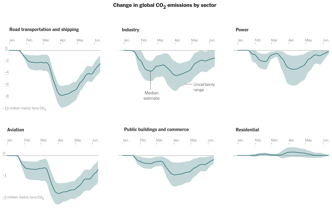
The main idea behind these plots is layering an area plot on top of a line chart with the area shaded by the LOW and HIGH columns -
global_emission = pd.read_csv('global_co2_em.csv', sep=';')
global_emission = global_emission.iloc[1:]
global_emission = (global_emission
                   .pipe(drop_columns, *[['REGION_ID', 'TIME_POINT', 'REGION_CODE', 'REGION_NAME', 'TOTAL_CO2_MED', 'TOTAL_CO2_HIGH', 'TOTAL_CO2_LOW']])
                   .pipe(set_datatypes))
line = alt.Chart(global_emission).mark_line().encode(
    x='DATE:T',
    y=alt.Y('TRS_CO2_MED:Q'),
)
band = line.mark_area(opacity=0.3).encode(
    x='DATE:T',
    y=alt.Y('TRS_CO2_LOW:Q'),
    y2=alt.Y2('TRS_CO2_HIGH:Q'),
)
line+band
Now we are going to change the data so that we can facet it properly like in the article's chart -
data = pd.concat([pd.melt(global_emission.filter(regex='_MED|DATE'), id_vars=['DATE'], var_name='MED_KEY', value_name='MED_VALUES'),
                  pd.melt(global_emission.filter(regex='_HIGH|DATE'), id_vars=['DATE'], var_name='HIGH_KEY', value_name='HIGH_VALUES'),
                 pd.melt(global_emission.filter(regex='_LOW|DATE'), id_vars=['DATE'], var_name='LOW_KEY', value_name='LOW_VALUES')],
                axis=1).T.drop_duplicates().T
data = data.assign(sector = data['MED_KEY'].apply(lambda x: "Road transportation and shipping" if x.startswith('TRS') else "Industry" if x.startswith('IND') else "Power" if x.startswith('PWR') else "Aviation" if x.startswith('AVI') else "Public buildings and commerce" if x.startswith('PUB') else "Residential"))
#data
area_low_high = alt.Chart().mark_area(opacity=0.5).encode(
    x=alt.X('DATE:T', axis=alt.Axis(format="%b")),
    y2= 'HIGH_VALUES:Q',
    y= alt.Y('LOW_VALUES:Q', axis=alt.Axis(domain=False, tickCount=5))
)

line_med = alt.Chart().mark_line().encode(
    x='DATE:T',
    y='MED_VALUES:Q'
)

alt.layer(area_low_high, line_med, data=data).facet(
    facet=alt.Column('sector:N',
               title="Change in global CO\u2082 emissions by sector",
               sort=['Road transportation and shipping', 'Industry', 'Power', 'Aviation', 'Public buildings and commerce', 'Residential'],
                     header=alt.Header(labelFontSize=15, labelAnchor='start', labelFontWeight='bold')
              ),
               columns=3,
            ).configure_axis(grid=False, title=None).configure_axisX(orient='top', labelPadding=20, offset=-27).configure_view(strokeWidth=0).resolve_scale(x='independent').configure_header(
    titleFontSize=20,
    labelFontSize=14,
    titlePadding=50
)